Monday, August 28, 2006
THE BLACK RHAPSODIES OF BRIAN DE PALMA
There does seem to be a bit of Brian De Palma blowing in the cinematic winds these days leading up to the release of The Black Dahlia, and it’s taking form in a lot of interesting posts and comments on the director and his films on some very smart blogs. I’ve already mentioned Slant’s Auteur Fatale series, as well as well-considered observations from That Little Round-headed Boy (whose piece on Mission to Mars even gets a mention from the oracle at De Palma a la Mod), Girish and Peter Nellhaus. Now you can add Peet Gelderblom’s two cents to the coffers of fine writers checking on De Palma. Peet muses about paradox in De Palma's work on his blog, Lost In Negative Space, an off-shoot of his excellent film criticism site 24 Lies A Second. (Peet also points to Soundtrack.net where snippets of Mark Isham's score for The Black Dahlia can be heard.)
(If anyone knows of any other good writing on De Palma that could use a link, please let me know!)
There’s so much interesting going on about De Palma that I had been regretting not picking up the ball and running with it myself. But then a message from Peet this afternoon reminded me that, actually, I had. I’d just left everything in the comments column of my recent post, "Brian De Palma: Critical Black Mass." The comments there, from Maya, Tom Sutpen, TLRHB, all add up to an excellent consideration of how this director functions (and sometimes doesn’t function), especially in a critical world that seems to value someone like Sam Mendes more than it does a true soaked-in-cinema provocateur like De Palma. But it was SLIFR reader Cerb Chaos who posed a query that finally got me into the fray:
”I not only dislike (De Palma’s) work, but am confused over the reception he has been given by critics whom I mostly agree with wholeheartedly. True, I have not seen such films as Carrie, Scarface, and Sisters, which are more often cited as his masterpieces, but after my experience I am not so excited to see them. Are they that much better?”
I hope that my own thoughts, intended as a response to Cerb Chaos, can function on their own as a general consideration of why De Palma’s films most often (but sometimes do not) work for me, and therefore might be considered a worthy contribution to the snowballing impromptu blog-a-thon-style discussion of this great director. But I also want to highlight those comments that I received that really serve to illuminate this director, who is so confounding and exasperating to some, and so exhilarating and compelling to others. To start, Maya connects the dots between Antonioni and Blow Out, a connection that goes well past a similarity in titles:
“Blow Out… reminded me of Antonioni, both in its forensic epiphany and the reference to what Girish has already identified as a ‘cinephiliac moment’: when the night wind blows through the trees, replicated almost with tenderness in the scene where Travolta is recording the night wind.”
Then Cerb Chaos checks in, reacting, I’m assuming, to the collection of rhapsodic writing referred and linked to in the “Critical Black Mass” post:
”I have seen three of De Palma's films, and in all likelihood they are not a correct representation. But I don't get the love he's gotten on the film sites I visit. Mission to Mars, which as mentioned has an essay by the always articulate LRHB, is quite simply the worst movie I have ever seen in theaters, and one of the ten worst movies I've seen. Period. This was the first De Palma movie I saw. It did not leave a good impression. I saw The Untouchables, which is entertaining, but nothing that I feel any kind of love for.
After discussing this with my father, he persuaded me to watch Dressed to Kill, which deemed to devolve into a game of “spot the homage.” De Palma's homages seem to me too obvious and take me out of the movie watching experience. After watching the movie my dad asked me what I thought about it. I admitted that I didn’t like it. He replied that he thought it had aged badly, losing what novelty it had when first released.I not only dislike his work, but am confused over the reception he has been given by critics whom I mostly agree with wholeheartedly. True, I have not seen such films as Carrie, Scarface, and Sisters, which are more often cited as his masterpieces, but after my experience I am not so excited to see them. Are they that much better?”
Then it was Tom’s turn:
”I'm not as great an admirer of DePalma's as some (though what films of his I like I have very high regard for), but I do understand why other cinephiles find much in his work to rhapsodize over.
There are few filmmakers, after all, who evince as complete an affection (albeit a critical one) for Cinema as Brian DePalma; and his engagement with it, as reflected in the films themselves, is never less than fascinating. At worst, yes, there are times . . . I number much of Dressed to Kill among them . . . when he overborrows and the whole thing sinks to the level of empty homage, but far more often he takes this prior material and redeploys it in extremely intriguing ways.
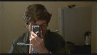
In Blow Out, for example, DePalma doesn't simply use the Antonioni material to create what Girish righteously calls a 'cinephiliac moment', he fully absorbs it into his own sensibility (a sensibility I think one can find in its purest state in his early comedies) and subtly transforms it in the same breath. He re-claims it in the name of the cinephile, if you will. On these occasions, DePalma's construction of the Thriller becomes as purely cinematic as Jerry Lewis's construction of visual gags; and far more personal. How could a cinephile not go gaga over it?
A brief word on The Black Dahlia: I can think of few artists who could more profitably collide than DePalma and James Ellroy (Ellroy, in his crime novels, applies a technique similar to DePalma's suspense numbers), but personally I would have liked to see what DePalma could do with a dense, maddening, gruesome novel such as Ellroy's The Cold Six Thousand. Black Dahlia seems almost too easy a challenge by comparison.”
And finally, That Little Round-headed Boy, celebrated and eloquent defender of Mission to Mars:
“I'm not blind to DePalma's weaker pictures, but what he creates on film (in his best films, at least) is something akin to a dream state, where you completely lose track of being a viewer engaged with a piece of celluloid and just become one with the experience (That's the same reason I don't dismiss Kubrick's Eyes Wide Shut, which has many clunky passages and a bad performance by Cruise, but also has moments of haunting hypnotic poetry.) Any director who can do that with film simply cannot be dismissed so handily, or thoroughly rated in an up/down thumbs system. I understand consumer criticism that needs to rate the movie on all its elements, but the beauty of what we can do on blogs is explore films for more than that. Basically, it doesn't matter to me if a film is good or bad in sum, but whether it's interesting enough to stay with me, rattle in my head, or make me want to see it again. I think those are equally valid ways to discuss and understand film.”
Thanks, Maya, Tom and TLRHB. And thanks too to Paul C., who is a champion of both Phantom of the Paradise and Raising Cain, and to Peet for encouraging me to go back and make this an “official” unofficial blog-a-thon contribution. (Some might call it shameless recycling. But not you, right? Right?!)
But mostly, thanks to Cerb Chaos for being forthcoming about your disagreement with what seems to be (in this instance anyway) some kind of critical consensus that you're honestly seeking to understand. I’m not saying that the comments, above or below, will necessarily change your mind or anything. But I do appreciate the spirit in which they were put forth, and I’m glad to be able to say that they were, I think, received in the same spirit— one of furthering understanding of all points of view on a figure as complex and controversial as Brian De Palma. It was your comments that finally inspired me to try to briefly (ha!) put into some shape or form what it is about the director that I find so personally transfixing. That attempt is what follows here.
*************************************************************************************
De Palma is one of those filmmakers who seems to inspire either fierce devotion or fierce hatred-- there doesn't seem to be much middle ground when considering his films. (And considering his subject matter and his insinuating, exploratory, personally implicating way with the camera and story structure, should this be so surprising?)
I've always found De Palma to be a compelling filmmaker, particularly coming, as I do, from the point of view of a cinephile, even when I've found his work off-key or ill-advised. But since the release of Femme Fatale, I've come to realize with just how much esteem I hold this director-- he's surely one of my favorites now, and perhaps one of the two or three best American directors currently working. Yet I've never felt bound to look at his work with a blindly approving eye and, indeed, there are several movies in his oeuvre that, despite their clear thematical relationship to the rest of his work and to the history of cinema he draws upon, seem fundamentally uninspired, tired, atonal.
I'm thinking primarily of movies like Obsession, and also Body Double, which I recently revisited-- I revised my opinion upward slightly, but still don't think much of it-- and the absurdly overestimated Scarface, which Pauline Kael called "a De Palma movie for people who hate De Palma movies."
I also think less of The Fury than most De Palma enthusiasts do. To my eye, it's filled with images of sinuous, beautiful rage and the poetry of emotional agony, and it sports some terrific performances-- John Cassavetes, Charles Durning, Carol Rossen, Amy Irving. Yet at the same time it seems rather misshapen at times as a narrative, hurried and choppy in moments where it should be languid and seductive, and I think it fails to build up a true head of black steam by its conclusion, despite the memorable dispatching of Fiona Lewis and, of course, Cassavetes. It's clearly a classic De Palma in its concerns and its approach, and compared to just about any other similar effort from just about anyone else it's clearly technically superior. But compared to some of De Palma's other works from the same period I just don't think it's as perfectly crafted or consistently imagined. All that said, I still enjoy revisiting The Fury every couple of years or so.
But ask me what De Palma films I'm over the moon for, either with the kind of minor reservations I'd have for any filmmaker, or with none at all, and the list is much longer: Hi, Mom!, Sisters, Carrie, Dressed to Kill, Blow Out, Casualties of War, Carlito's Way, Mission: Impossible and Femme Fatale, with a second tier occupied by Phantom of the Paradise, The Untouchables and Raising Cain. Cain, in fact, is on my short list of De Palma titles I'll be revisiting soon, along with Snake Eyes, Mission to Mars, The Bonfire of the Vanities and hopefully even Wise Guys before The Black Dahlia bows.
As Tom says, it's De Palma's engagement (hugely key word) with cinema and cinema history that, plainly enough for me, places him outside and above the class of copycats with whom he's so frequently grouped. He's using key influences (Hitchcock, of course, but Antonioni, Godard, Chabrol and Kubrick as well) not as signposts to clue movie eggheads in as to how smart and crafty he is, but as seedlings for the progression of his vision over the course of his career, as the foundation of a structured, astringently clear-eyed, yet sometimes subtly hallucinatory way of visualizing the world through the cinema. The audiences "sees" the cinema, but De Palma also uses the cinema itself to see, to reflect back on the world, on the audience, in a meaningful and not always comforting fashion.
De Palma's movies, sometimes because of their excessive stylization, can seem uneven, to have not "aged well." There are moments in both Dressed to Kill and Blow Out that seem thin, less well thought out. (Is it coincidence that they seem to be those scenes that feature Dennis Franz and Nancy Allen in one-on-one situations?)
But each movie, even within scenes that may not seem to be "working" for sensibilities that have have moved 20-25 years down the road, relies on relevatory visual strategies and cues that can often help the viewer past the occasional lumpy exposition or weak performance by engaging him or her in the film's structural purpose-- I'm thinking here of how De Palma uses the multilayered framing and levels of sound in the interrogation scene in Dressed to Kill to tickle our imaginations and stimulate our perception during an otherwise banal scene-- Keith Gordon eavesdropping on Franz's questioning of Allen-- seen through layers of windows, and through various and subtle deep focus/split screen techniques.
I think you're right on the money, Tom, regarding Blow Out as well. De Palma absorbs the Antonioni material, all right, and I'd suggest he goes far beyond what Antonioni was able to achieve, or maybe even what h was interested in achieving, in Blow Up by embracing the crude "plot" elements of the witnessed murder. Where Antonioni abandons this narrative line, for reasons either based in existential malaise, or perhaps a disinterest in exploring the possibilities of mere melodrama, De Palma grounds his film in it and expands the elements Antonioni abandons into a vision of political paranoia and personal responsibility that is far more potent today than are his fellow Italian's mod London mind games.
I cannot imagine sitting through the first 20 minutes of Blow Out and not being completely glued to the screen to see the rest. That's an opening 20 minutes that holds within it the gruesome, salacious comedy and fake-out gimmickry of the movie-within-a-movie; the stunning logo of the movie itself (scored with near-subliminal, prescient use of some of the most integral and agonzing sounds that will be heard later in the film); the enthralling split-screen under the opening credits, which contrasts expository information setting up the importance of the Liberty Bell Parade and the emergence of the Kennedyesque political figure with Jack (Travolta) preparing to record sound out in the field; and of course, that absolutely perfect sequence in which De Palma heightens every sound (the owl, the overheard pedestrians, the faint squeal of tires) in anticipation of the recording of the sounds of the horrific event that will kick the film's primary mystery into gear. You're damn right, Tom-- this cinephile is definitely gaga over it.
And it's impossible for me to see Blow Out and imagine coming away, despite the apparent influences of Antonioni and Hitchcock, thinking of it as anything but a De Palma film, a work of art that couldn't have originated from anyone else. To downgrade an artist because he acknowledges the whole of the history of his art form, and specific avenues of interest that have sparked his creativity in the creation of his work, would be to deny the manner in which artists in every medium have taken previously known works and expanded on them, turned them inside out, filled old wine husks with new wine. De Palma is a polarizing artist whose output has never taken a straight line-- he gets better with age, it seems to me, even if there are disturbing, uneven zags and zigs from film to film. And even his work for hire (Mission: Impossible, Mission to Mars), while sometimes hit and miss, is shot through with this director's fury, deftness with chronology, visual confidence and, in the case of Mars, belief in the lyricism and power of the image to overcome the occasional insufficiency of the spoken word.
I have no idea where The Black Dahlia will land on the scale of Brian De Palma's career, but I'm hard pressed to think of another director in 2006 whose work I'm so much looking forward to seeing.
Thursday, August 24, 2006
SHORT ROUNDS: ALL ABOUT THOSE HIGH-FLYING SNAKES AND THE PLANE THEY RODE IN ON
You’ve probably heard of the movie Snakes on a Plane. Of course you have. You’ve been hearing about it nonstop for about six months. Or rather, you’ve been hearing about the unique studio marketing campaign designed to keep the Internet buzzing about its high-concept low concept. And in the long shadow of its less-than-spectacular opening weekend box office numbers, it seems that many of those in the fan base who were first seduced by the giddiness of producing an action movie under such self-aware circumstances are now checking in with theories about why the expected audience didn’t show up in huge waves, how the marketing failed, how it might have been approached differently, and whether or not interest in the movie peaked too early—would May have been a better release date, to capitalize on the intense anticipation as well as position it more like a Bruckheimer bash rather than a Cormanesque alternative to the offerings of genuine quality available during the dog days of August? (Insert arched eyebrow here.) Some of these discussions are self-serving slices of deep-dish 20-20 hindsight served up as tasty fodder for heated-up Internet message boards, and others are characterized with genuine curiosity about what some worry might become a template for furthering Hollywood’s obsession with achieving a sort of all-things-to-all-people nirvana. (Perhaps the disappointing Snakes numbers can at least dampen those fears a trifle.)
Unexpectedly low returns on aggressively marketed studio movies-- certainly not an unfamiliar scenario to have ever played out on the pages of the daily trade papers. The success of the touchstone campaign that got all the tails wagging over Snakes-- the grassroots is-it-real-or-isn’t-it Internet push behind The Blair Witch Project-- looks like it will remain, for the immediate future, the gold standard of virtual fleecing. But other attempts to whip up a priori consensus on Web sites and chat rooms have been far less reliable—just how many studio executives, after all, were convinced that Superman Returns was solid gold based on pre-release cyberchatter? Internet enthusiasm makes for great copy in puff pieces to be printed the Sunday before a big release, but it seems that once the film gets unleashed into the real world those figures relating to audience interest don’t always make the proper translation into actual box-office numbers.
Maybe New Line and all the Hollywood stat mavens just haven't figured out yet what “X” number of hits on Snakes on a Blog means in terms of actual people who will stop surfing the Web long enough to actually go out and see a movie, even one like this. And I think the marketing department found themselves confronted on opening weekend with a vast swath of moviegoers who wouldn't pay to see a movie they've prejudged (because of all the hype they've heard, studio-generated or not) to be bad, intentionally or unintentionally. Suddenly, New Line's marketing goals became a little more daunting, their "Look, Ma, no brains" strategy a little less like a sure thing. And now, with American audiences not nibbling as hard on the Snake bait, the studio is suddenly faced with selling an action movie in foreign markets that usually take their testosterone doses a little more straight up, markets where ironic distancing from the movie being advertised in the advertising itself is less likely to be understood, therefore much less effective.
But, really, enough about the sell job. The question that actually held my interest in the weeks and days before actually seeing Snakes on a Plane was (and this might strike some as rather quaint), what was the movie like? Was the movie being sold really a deliberately-so-bad-it’s-good postmodern smirkfest? Was it an indecisive, low-ambition thriller hamstrung by the kind of ineptitude that can’t be faked—in other words, was it so bad that it was just bad? Or was it maybe a self-aware attempt at recasting familiar action-adventure molds with a minimum of winks and nudges that had a chance at succeeding as a respectable thriller on its own terms?
Snakes was directed by David R. Ellis, who previously concocted the delightfully sadistic Rube Goldberg grand guignol of Final Destination 2 and last year’s hopped-up thriller Cellular, and my anticipation of this new movie was grounded firmly in what I hoped he could bring to the party as a sly coordinator of action-movie magic. As it turns out, Snakes hasn’t the sleekness of Cellular or the gonzo imaginative conviction that goosed the imagery in FD2-- it’s a much more straightforward piece of work, by design, and as such it’s not as gaudy a showcase for Ellis’ talents with clean action choreography as those other films. Instead, it’s merely a solid, well-paced, energized effort by this director, who will hopefully be able to parlay the attention drawn to Snakes into more and better opportunities to craft amusing and wizardly action fare in the years to come.
(I couldn’t help wondering, however, what Ronny Yu, the director who was originally attached to Snakes, might have done with the same material. Yu turned the potential turd of Freddy vs. Jason into a visually deft and clever, rock-‘em-sock-‘em genre standoff that was far more fun than anyone had a right to expect. He also helped shepherd the Child’s Play series from its creative dead-end as a straightforward slasher series toward the more fancifully rude and gasp-inducing meta-comedy of Bride of Chucky and writer-director Don Mancini’s peak follow-up, Seed of Chucky. Ronny Yu could have been just the guiding hand to send Snakes into the stratosphere.)
What Ellis does bring to Snakes, however, is the ability to balance on the thin wire that segments the movie’s well-documented concept—hundreds of snakes let loose by a Hawaiian gangster on a jumbo jet as a means of ensuring a plane crash that will kill an onboard witness to a gruesome murder—between sincerely meat-headed thriller and self-deprecating, over-the-top camp for the post-Zucker-Abrahams-Zucker age. And both the director and the movie benefit in this regard by having Samuel L. Jackson’s name above the title. This actor has made a career out of embodying the very concept of inspiring laughs while at the same time asking (demanding!) that his characters be taken surface-level very seriously, as intended. Jackson, as the F.B.I. agent who is escorting the murder witness back to Los Angeles and ends up spearheading the fight against the plane’s reptilian invaders, knows exactly how to pitch this material, and he’s never once caught winking at the camera, even during the delivery of that now-famous fan-inspired line, which has the feeling of being wedged into the screenplay by committee, all right, but which also plays surprisingly well, at least with the cheering Saturday night opening weekend crowd that surrounded me and my friends.
But as a straightforward measure of indicating what the movie might be against what it turns out to be, the ultimate effect of the Snakes marketing deluge can be said, I think, to be a textbook case of truth in advertising. The movie never once reveals itself to be anything beyond the claims of the title, and consequently it never accumulates an extra level of social satire or psychological subtext to which some of the best drive-in exploitation-type fare (like Paul Bartel’s Death Race 2000 or Lewis Teague’s Alligator) could lay claim. On the other hand, if you don't want to see a movie about snakes overrunning a plane and laying the bite, in some excruciatingly creative and funny ways, on a series of B-movie stock passengers, at least you have a fair idea of what you’d be missing.
The happy surprise is that it turns out Snakes on a Plane is not, in the Jerry Bruckheimer-Michael Bay "tradition," an overinflated blockbuster full of B-movie allusions, but instead a bona fide heart-and-soul cheapie. (Sort of-- what $40 million doesn't buy these days, eh?) It's a real exploitation movie in the best sense of the word-- this movie often feels, sounds and looks like it could have come straight out of the disaster movie movement of the early to mid 70s. And so does that passenger list, which includes an insufferably haughty British prig, a high-maintenance model-type (complete with pillow-perched Chihuahua), a stoic flight attendant on her last run before a long-overdue career change, a young mother and her newborn, a pair of pre-teen brothers, and even a OCD-plagued hip-hop star and his portly entourage who all, refreshingly, have something more to do than stand around fleshing out racial stereotypes. It even does a good job (intentional or not) replicating the clunky narrative setups and exposition of a ‘70s disaster epic—the movie starts off feeling like it might not shed the veneer of cheese evident in these opening scenes, but it eventually takes flight and gets better, funnier and more exciting as it hurtles along toward its white-knuckle climax. And along the way the snake action—real, CGI, rubber, whatever—hits a lot of “boo!” bull’s-eyes and heights of genuine, slithery fear too.
Snakes on a Plane is a wild, chipper, economical good time, if you’re inclined to accept it on its own terms—that is, a relatively straight action thriller with a healthy sense of humor, not a Rocky Horror irony-a-thon ready-made for mid-flight audience condescension. It balances jolts and laughs in a fashion that rarely tips too far in the wink-wink, nudge-nudge direction, and I had a genuine good time in its company. And maybe even more importantly, I didn't feel unclean afterward, as if I'd been cruelly duped or abused by some cynical marketing campaign, or my own desire for cheap thrills. Snakes on a Plane may have been sold as though it was intended to be all things to all people, but thankfully it plays like a movie intended for true believers-- thrill-seekers in thrall to the kind of exploitation fare typical of a Saturday night bill at the drive-ins of 30 years ago. The movie is smarter than advertised too, and it has fun simply running full tilt with its goofy high concept, and that includes delivering a lot of the gore and nudity and tough, nasty talk that earmark its true roots.
As my friends and I all walked out afterward, we were happy to discover that we all enjoyed Snakes on a Plane to one degree or another. (Even my wife, eternal good sport and serial avoider of movie violence that she is, had to admit she had fun, though often with her eyes closed.) We hit the escalators to the parking lot and chattered amongst ourselves, and I realized I was coming off the same kind of thrill that I experienced after seeing something like Death Race 2000 on its original release, a piece of pulp widely assumed to be irredeemable trash that turned out to have a vitality and charge all its own. Snakes on a Plane has a similar sort of B-movie buzz, and a hiss and a rattle to boot, but only time will tell if it ends up having the kind of enduring appeal that movie has enjoyed amongst the genre cognoscenti. Whatever the movie's fate on the cultural landscape, I'd like to think that somewhere in the Movie Afterlife over this past weekend, the likes of Irwin Allen and Jennings Lang and William Castle, final box office numbers be damned, were observing, smiling and saying to each other, "Damn, I wish we'd thought of that!”
(Portions of this article first appeared as a comment provided to Jim Emerson's Scanners blog.)
************************************************************************************
Apparently, though, for some genius the movie’s concept wasn’t high enough. In a move that would have horrified even William Castle, two live rattlesnakes were turned loose in an Arizona movie theater this past weekend that was showing Snakes on a Plane.
Good story, except for one thing: a day later police are claiming the "Snakes in a Theater" story is a bit of a hoax. And even in this follow-up story about what turned out to be a nonstory, there's still room to mention the movie's disappointing opening weekend grosses. Where's Howard Beale when we really need him?
************************************************************************************
Blogger Dave Robidenza, who runs the show at American Waste, had a wittier, less potentially homicidal, 100% hoax-free way of having fun with the whole Snakes on a Plane idea. He details, in the afterglow of seeing the movie at the Mission Tiki Drive-In this past weekend, some imaginary recasting of Samuel Jackson’s testy F.B.I. agent and invites your contributions as well. This has the makings of a delightful parlor game, don’t you think?
Monday, August 21, 2006
BRIAN DE PALMA: CRITICAL BLACK MASS
The tip from David Hudson and GreenCine Daily is that Slant magazine is getting the ball rolling toward the September 15 release of Brian De Palma's latest film, The Black Dahlia, in a big way—they’re coordinating a symposium of critical writing designed to provide a more-or-less all-encompassing look back at the director’s fascinating, troubling and sometimes troubled oeuvre. (Personally, I’m looking forward to someone taking another look at Wise Guys and The Bonfire of the Vanities. Seriously. I'm curious.)
De Palma has always had a love/hate relationship with the critical establishment, one whose fires he often stoked himself. According to Eric Henderson, “The more critics got on De Palma's kinky nuts, the more he was provoked to act out his own worst (and by "worst," I mean best) impulses. Not unlike Carrie bringing down holy hell upon her classmates to the tune of "Plug it up! Plug it up!," De Palma's oeuvre owes at least some part of its brash vitality to the destructivism his critics sparked in the director's bruised ego. When modern critics attuned to his wavelength dare to make analogies to other auteurs, they don't name check Hitchcock. They go straight to Godard. With all apologies to Scorsese, Coppola, and those other guys, there's only one American director capable of creating a work of hate art as excoriating as Weekend.”
I can’t wait to start digging into what Slant is going to be coming up with the next few weeks. You can get started on Slant’s series entitled “Auteur Fatale: The Films of Brian De Palma” right here. And if that’s not enough to slake your thirst, check out Peter Nellhaus on The Wedding Party, Girish on The Fury, That Little Round-Headed Boy on Mission to Mars (thanks, TLRHB), and the spectacularly complete De Palma a la Mod for absolutely everything else.
(And thanks also to Eric for the wonderful shot of Sissy Spacek that I cribbed for this post from his terrific blog When Canses Were Classeled. Eric, I hope you’ll forgive my shameless pilfering, but that’s absolutely my favorite frame of that shot of Carrie White, immediately pre-telekinetic explosion. Someday, when I finally get my screen-grabbing program up and running, maybe I can return the favor?)
FRIZ FRELENG: THE TWEETY ANTIDOTE
The following is an appreciation of Friz Freleng, part of the Friz Freleng Blog-a-Thon being shepherded by Brian Darr at Hell On Frisco Bay to commemorate the director's 100th birthday. My consideration of Freleng is based strictly on observations regarding two Tweety shorts—“Canary Row” and “Putty Tat Trouble”-- and two others featuring hapless gangsters Rocky and Mugsy—“Golden Yeggs” and “Bugs and Thugs”—all of which are available in the Looney Tunes Golden Collection Volume One box. I can't pretend to have a proper overview of Freleng’s career or his Warner Brothers output— it’s just too vast for a short post or my capacity to take it all in. I’m hoping to get a better view of the big Friz Freleng picture by reading the pieces submitted by my fellow Freleng blog-a-thonners. Like Brian said in his post, feel free to disagree with anything I’ve come up with here. When it comes to Friz Freleng, I want to know more.
**********************************************************************
I came of entertainment age in the early ‘60s, and in so doing I was immersed in the TV cartoons of the day, all of which seemed to have leapt from the loins of William Hanna and Joseph Barbera or the Harvey comic book catalog. But as far back as I can remember, there were always Warner Brothers cartoons available, in some form or another, on Saturday mornings too, and those always trumped everything else. Come the morning of the first day of the weekend, it didn’t matter what else was going on—everything else stopped, all available Froot Loops and Cocoa Puffs and Crispy Critters were readied, and the dial turned to what I think of as TV’s original WB. The cartoons appeared on Saturday morning TV, in one form or another, from 1962 until well into the ‘80s, under various banners-- The Bugs Bunny Show , The Porky Pig Show, The Road Runner Show, The Bugs Bunny Hour and the most bounteous incarnation, in terms of program length, The Bugs Bunny-Road Runner Show, which claimed 90 minutes (including commercials) of Saturday morning CBS time. It was these showcases, which gave equal time to Bugs, Daffy Duck, Tweety and Sylvester, Wile E. Coyote and the Road Runner and the entire roster of supporting characters and bit players, that was the introduction, for most of us who pulled up the tail end of the Baby Boom, to the joys of these short cartoons, which were originally produced by Warner Brothers to run theatrically, most of them dating from the late ‘40s and early ‘50s.
(It wasn’t until I started seeing them show up before features at the local movie theater that I realized they had also frequently been cut by overzealous network censors looking to protect the youth of America from the insidious influence of stylized cartoon violence. I suppose until then I’d just chalked up scenes that seemed to end before they were supposed to, along with the mismatched sound and visuals that would frequently earmark the cuts, as by-products of bad prints—I was certainly used to seeing enough of those running at the local movie theater.)
But even when the Warner cartoons were cut, enough of their anarchic spirit and verbal/visual wit still shone through the roughshod splices to expose the rest of the network Saturday-morning fare as relatively innocuous and uninteresting. And even though the cartoons ran without opening credits, with only a cheaply produced title card cluing the kids in to what the cartoon was called, it became fairly easy, after enough exposure to them, to discern the styles of the various directors, through the differences in the curves and angles with which the familiar characters were rendered from piece to piece, to the varying speeds with which the directors would take them through their often grueling paces.
A Chuck Jones cartoon was often discernible by the whiplash speed of the characters’ movements in and around the frame, or the way that Bugs might address the audience with a sly aside or a brief, knowing glance before waylaying Daffy’s brainpan with the butt of a shotgun disguised as a bundle of flowers. Bob Clampett’s animation, which I was more familiar with from the Beany and Cecil show, highlighted a kind of fluidity, a literal roundness, both to the characters (he did, after all, do a lot of the original Porky Pig shorts) and the way they negotiated a path through their given space. The entire Clampett universe had a sort of malleable quality that resembled (a little too much for my taste) the sinister mutability of some of the rural-tinged Disney shorts. And Robert McKimson’s style, one of my favorites perhaps because he tended to work with my favorite characters, Daffy and Foghorn Leghorn, was marked by the elasticity of his characters in their reactions to other characters—it wasn’t unusual to see Daffy’s entire head, which already featured a bill and a face that seemed slightly larger in McKimson’s world than in Jones’, literally elongate with rage during one of his tirades. And McKimson would also play up hilarious rates of speed of action butted up against each other for maximum comic effect—the blink of an eye was all it would take for Foghorn to go from quietly considering, from a step or two away, the hound dog sleeping in his house, to holding him by his hind legs with his left hand and beating him mercilessly, at a rate of about five whacks per second, with a wooden plank held in his right.
Friz Freleng directed Bugs Bunny and Daffy Duck occasionally, and he also handled minor characters like Speedy Gonzalez, but the cartoons he became most closely associated with in my mind were the ones featuring the Warner Brothers character I cared for the least—the insufferably cute Tweety. His relationship with the forever beleaguered Sylvester the cat was roughly that of the Road Runner to Wile E. Coyote, and though I was and am able to muster a sizable amount of sympathy for the food-chain follies of the cat and the coyote, I never harbored the kind of ill will toward the Road Runner that I did for Tweety. The reason, I think, is fairly simple. The Road Runner, though not blessed with speech, could often commandeer and bend physics to his will and manipulate circumstances to often outsmart Wile E. Coyote at his own game—eating bird seed tainted with gunpowder to no ill effect, or traveling down the Z-axis into a perspective mural of a highway designed to fool him and flatten him against the desert wall, for example. (Of course, Wile E. was a nemesis who again and again just as often outsmarted himself.) The very nature of Wile E.’s pursuit—constant motion on an endless desert highway—implies the action and movement are imperative to the Road Runner’s survival. But Tweety was often far too passive in the various cat-and-bid games in which he often found himself at the center. He rarely did anything but sit guilelessly by as Sylvester found one way after another to beat himself—Tweety was rarely an active participant in the action (the one exception I can think of being the cartoon in which he ingests a potion that turns him, without warning, from tiny canary to gigantic, hulking, Hyde-like beast of prey) and was always far too willing to let his cute speech impediment serve as and the be-all and end-all of his charm.
So I decided the thing to do would be to screen two of Freleng’s Tweety titles—“Canary Row” and “Putty Tat Trouble”—to try to discover what Freleng brought to the party that helped make Sylvester and Tweety such an enduring pair, despite an aversion to the yellow avian with the swelled cranium that I can’t help but suspect is shared by at least a few others.
The first thing that struck me about Freleng’s approach is that, as much as the other directors are concerned with speed of action and movement within the frame, his cartoons—at least these four—seemed perceptibly more measured, if only by a degree or two, in their pacing than those of Freleng’s contemporaries. Freleng doesn’t seem as concerned with the kitchen-sink approach to piling on gags that might suit Jones, or with the rat-a-tat, in-your-face verbiage and slapstick one might encounter in McKimson. From the opening song Tweety sings while swinging on his perch (“I’m a tweet wittle bird in a dilded tage/Tweety’s my name, but I don’t know my age/I don’t have to wowwy, and that is that/I’m tafe in here from dat ol’ puddy tat”) to the well-known line that opens the action in each Tweety cartoon (“I tink I taw a puddy tat. I did! I did! I did taw a puddy tat!”), Freleng’s Tweety shorts are marked by ritualized format or behavior. (This includes a patience for setting up gags and allowing them the time to reach a zenith of hysteria in their payoff, an aspect of Freleng’s directorial approach that is intelligently considered in the look at Freleng’s “High-Diving Hare” that Brian offers in his post.) This ritualization, I think, serves to prime the audience to expect a sort of comfort—we’re eased into this world in the same way repeatedly-- than they might expect to find in the typically anarchic visual style and borderline sadism of a Road Runner cartoon, and to expect that the antics of Tweety and Sylvester will be grounded more, if only ever so slightly more, in the day-to-day, the familiar.
What does seem visually distinctive to me in these selected Freleng shorts is the frequent de-emphasis on backgrounds, which tends to thrust the characters out toward the audience and away from their environment in a way that fairly abstracts them, especially in close-up. Freleng’s backgrounds, his settings, seem more simple and painterly than usual in “Putty Tat Trouble,” for example, all the better to call attention to the clarity and economy of the actions of the two felines—Sylvester and another unnamed tomcat—as they double (and usually neutralize) each other’s efforts to capture and consume the Yellow Swollen-headed One. And in the Rocky and Mugsy shorts, the backgrounds themselves are often abstracted into simple geometric shapes or distinctive silhouettes (I’m thinking mainly here of Rocky’s cliff-side hideout in “Bugs and Thugs”) which allow the action to effortlessly, and often invisibly, be thrown into sharp relief. And Freleng loves to put Sylvester through his paces by not just exaggerating physical space, as McKimson or Jones might do, but by stretching the limitations of physical space to hilarious, often horrific effect.
The set piece in “Canary Row” in which Sylvester slithers up a drainpipe that is about three times too small to ever contain him, only to be greeted mid-pipe by a falling bowling ball of roughly the same absurd proportions, which he is first crushed by, and then which he somehow swallows, all within the confined space of this narrow pipe. The ball, of course, immediately deposits itself in Sylvester’s now disproportionately expanded posterior, turning him into a furry version of a clown balancing on a ball—the ball being on the inside, which also makes him resemble a rolling punching bag as he careens helplessly downhill toward—you guessed it—the open doors of a bowling alley. And the pursuit of Tweety across a winter wonderland of snow dunes in an urban park in “Putty Tat Trouble” results in a hilarious gag which has Tweety escaping into one said dune and leaving a perfectly Tweety-shaped hole, of course. It’s only when Sylvester and the tomcat follow suit that the gag pays off—naturally, Tweety’s diminutive stature has allowed him to proceed unscathed underneath the post office box hidden beneath the snow, the sudden encountering with which flattens both cats against each other and pushes them frightening close to two dimensions. (This routine got the biggest laugh from my four-year-old daughter who squealed, “Look, Daddy! The kitties turned into a pack of cards!” That’s my girl.)
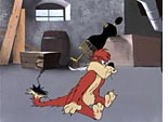
From Frelengs' "Hollywood Daffy" (1946)
Freleng also has a taste for using his backgrounds and cityscapes to slip in lots of juicy, throwaway comic asides, many more so than I recall seeing in the work of the other directors. The four cartoons I watched were ripe with deliciously funny signage (the kind which found further flowering in Mad magazine and, most recently, in the Wallace and Gromit films) that could go unnoticed without harming the trajectory of the cartoon, but the recognition of which adds layer upon layer to the experience of these seven-minute worlds and makes us understand how artfully these directors could avoid projecting exclusively to the perceived audience for cartoons—children. When you notice, for instance, that the housing complex Sylvester is about to infiltrate in his pursuit of the smug Tweety is called the Broken Arms Apartments, that’s a big and as subtle a clue as is necessary to imagine the violent fate that might be awaiting him. (Perhaps the oddest reference is a raggedy bill posted to the side of a building seen during “Canary Row” that could be the source of a disorienting and weirdly perplexing shiver if it rings your bell. “Auto Races! 7:30 p.m.! Potter’s Field” reads the bill, which immediately gets the mind wandering into the ghoul zone thinking about just how many fatal games of chicken are run for public entertainment on a race track that runs through a graveyard for the dispossessed.)
And Freleng doesn’t seem to be beyond a bit of Hitchcockian self-promotion and gamesmanship either. In a nod to the Master of Suspense’s penchant for inserting cameo appearances of himself into the action, Freleng’s own visage (in a Dali-esque pose) can be spotted in a portrait propped up carelessly along a cellar wall in “Putty Tat Trouble.” And the man who was named Isodore but known primarily as “Friz” seems unusually delighted in applying his own name to a variety of straight-faced jokes on the banality of advertising. In that same “Putty Tat Trouble,” in that same cellar where Tweety runs into a double of his own to counter that of Sylvester’s tomcat nemesis—a toy sipping bird that bobs its beak into a glass of water and inspires Tweety to do the same—can be spotted an upended cardboard box bearing the legend, “FRIZ—America’s favorite gelatin dessert.” And again from “Canary Row,” there is a sign on the side of one of Freleng’s nondescript city buildings that cries out, “Drink Friz! Six delicious flavors!” Hitchcock glimpsed jumping on a bus or, most convolutedly, in a newspaper read aboard a drifting lifeboat, is amusing, all right. But the exploitation of one’s own nickname in order to associate it with treacly desserts or excessive carbonation, well, that’s a whole different league of self-deprecating wit, as far as I’m concerned.
It’s probably that self-deprecating wit, in the end, that provides as much of a clue to approaching Freleng’s style as anything else. His was probably, for me, the least visually distinctive, the least immediate recognizable of the four Warner animation directors I’ve mentioned here, yet his work displays a simplicity, a modesty, and a sharpness that all somehow lend it weight-- in a graphic sense, not in the sense that you feel his images struggling to take flight, which they often do. Also, his characters—however ridiculously exaggerated—seem grounded in their world in a way that some of the others, gifted with the ability that cartoons can bestow to make physical space their servant, simply don’t. Rocky the gangster, squat body stuffed under a overcompensating hat itself at least as tall as he is, brim covering his eyes, cigarette dangling from lips constricted by the stiffness of his deadpan tough guy line delivery, and Mugsy, ever-loyal, ever-dim and ever-gigantic, provide a disarmingly funny contrast, but they seem to really exist in their highly stylized space and you can see that, as much as they may zip around robbing banks, their true milieu is the getaway car and the hideout, where they can sit relatively still and assert themselves through graphic force (and the point of a pop gun) alone. (Seeing Bugs stuff the two of them, especially the hulking Mugsy, into a kitchen stove—“I must be dreaming. It couldn’t be this easy,” Bugs offers in a Jonesian nod to the camera”—is another great instance of Freleng making physical space accept his demands and coming up with a hilarious set piece as a result.)
Sylvester also seems more like a “real” cat (as does his scruffy competitor in "Puddy Tat Trouble"), through force of his downtrodden yet persistently confident personality, to be sure, but also through the way in which Freleng renders him as slightly worn-down, ungainly in a way that conveys a certain degree of believability on him as a cat whom we might have run across at one point or another. He’s clever, and he’s perpetually hungry, but he’s also constantly trying—his body language tells you this—to reconcile that hunger with his innate laziness. He hasn’t the grace or the speed to have much success as a hunter, but his lack of grace and speed goes a long way toward endearing him to us as a relatable figure, even, for some of us I suspect, a kindred spirit. That quality can be laid directly at Freleng’s creative feet for allowing Sylvester to be as regulated by physics as he is sometimes dodgy of them.
But even after tonight’s four-cartoon mini-festival, scored to the delighted squeals of my two daughters, their hearty appreciation of over-the-top slapstick, and their occasional gasps whenever someone would get beaned over the head with some blunt object, Tweety remains bothersome to me. Perhaps it’s that smug disregard for his enemies that Tweety flaunts while batting his eyelashes that sticks in my craw. Perhaps it’s that he rarely seems to participate in the action literally swirling and crashing all around him, but is instead content to sit and let it happen without ever getting a scratch or seeming otherwise physically affected. Perhaps it’s just that I find his gigantic yellow cranium graphically unappealing. Or maybe it’s that voice, too cloying and cutesy by half. (Sorry, Mr. Blanc, but nobody’s perfect!) Even the prodigious talent of a Friz Freleng can’t get me over my disdain for this spoiled little bird. There’s nothing “real” about him. (Is it too much to imagine that Freleng held him with some degree of contempt too?) Fortunately, in any given one of his cartoons, whether it’s a Tweety or one of the many others he did for Warner Brothers, there’s so much more going on to engage the imagination that not even a supremely annoying central character can derail the possibility of enjoyment that each cartoon holds within it. Tweety may swing on his perch in the spotlight, sing a happy tune, and escape Sylvester’s gaping maw once again, but it’s the grounding confidence and sharp wit of Friz Freleng that matters. He’s the Tweety antidote.
**********************************************************************************
Here are some of the links to those participating in the Friz Freleng Blog-a-Thon that Brian has compiled so far today. Check Hell On Frisco Bay throughout the day for further updates.
David Germain
Dennis Hyer
Gir (Gir's Room With a Moose)
Girish
Joe Campana
Josh (Jazz::Animated)
Peter Nellhaus
Richard Hildreth
Stephen Rowley
Tom Sito
Thursday, August 17, 2006
BABY SNAKES, NO PLANE
Late at night is when they come out
Sure you know what I'm talkin' about...
One day about 18 years ago I was home sick with the flu. I decided to lay down on the floor, wrap myself up in a blanket, make some hot Orange Tang and watch Frank Zappa’s Baby Snakes, which I had procured from a local video store. I remember I had a pretty high fever that day, and as Zappa’s movie began spilling out of my TV set, I began to get delirious. After a while I couldn’t tell if it was because I was sick, or because Zappa’s freeform throw-it-on-the-wall- and-follow-it-with-the-camera-as-it-doesn’t-stick-
but-slides-onto-the-floor approach, interspersed with generous dollops of Bruce Bickford's surreal (and, that day at least, slightly queasy-making) clay animation and large, juicy slices from Zappa’s 1977 Halloween concert were taking advantage of my debilitated state and sending me places in my head I was not equipped to go.
August 17, 2006. I had a fever last week for a few hours, but I’m okay now, and just in time, because the American Cinematheque will unveil, on this very evening, the only surviving 35mm print of what is, according to the AC’s press notes, “Zappa’s lost masterpiece,” Baby Snakes, here in Los Angeles at the Egyptian Theater at 7:30 p.m. (The movie will also show on August 31 at the Aero in Santa Monica.) Zappa’s aggressively playful, absurd big-screen account of his all-conquering (at least all who were there!) 1977 Halloween concert in New York City was famously tinkered with and fussed over for a good long time by Frank before he unleashed it on a supremely uninterested movie-going public back in 1979. Zappa’s vision was, of course, a few light-years ahead of its time (Grease was still the word back then, remember?), but it would have been ridiculous to think that anyone but his hard-core constituency would have sat up and taken notice of the film under even the most generous of circumstances.
However, the legend of the film prevailed, mainly through the popularity among the faithful of the film’s soundtrack, which features such FZ classics as “Titties ‘n’ Beer,” “The Black Page,” “Jones Crusher,” “Punky’s Whips” and, of course, the titular track, many of which were performed during Dweezil Zappa’s Zappa Plays Zappa concert by Baby Snakes central figure, drummer Terry Bozzio himself.
And now, Frank’s widow Gail is heading up an effort to restore the brilliant musician’s film library in time for the unveiling of what the AC terms a full-scale Zappa film retrospective ( !!!! ) in time for next summer’s Mods and Rockers Festival at the Egyptian. Baby Snakes is the inaugural shot off this particularly exciting bow. (Gail will be at the Egyptian tonight for a Q-and-A after the show.) Whether or not the screening tonight bodes well for an upcoming DVD release, I certainly don't know. But the rare opportunity to see Baby Snakes on the big screen, either tonight at the Egyptian or August 31 at the Aero, ought to be enough for Zappa fans and those interested in the arcana of Zappa’s zippy and twisted history of self-documentation on film. Like I said, I’m feeling fine tonight, and I’d love to be there, but I may just have to settle for a mug of Orange Tang and my 200 Motels laserdisc. But I’ll be there in spirit. Just like FZ.
AUGUST 16, 1956: BELA LUGOSI'S DEAD
Do yourself a favor— visit Tom Sutpen’s If Charlie Parker Were a Gunslinger… right now for a sublime, eloquent, strange and quite moving visual series on Bela Lugosi, whose death 50 years ago yesterday is commemorated by Tom’s Wednesday posts:
”Fifty years ago today, Hungary's most invaluable export to American culture... surrendered the last measure of his health; passing away after decades of steady dissolution and the rigors of his own rather weighty theatricality. If he was fated to be Hollywood's answer to DeSica's Umberto Domenico Ferrari, then he at least refused to go quietly, thereby instilling a ray of hope into those similarly dispossessed. For that, and much else, we here at If Charlie Parker Was a Gunslinger . . . wish to remember Bela Lugosi as fondly as America's film industry wanted to forget him.”
UPDATE 8/17/06 2:56 p.m.: Chris Oliver thankfully reminds me and everyone that tomorrow is Bela Lugosi Day on Turner Classic Movies-- 17 films in all, including Tod Browning's Mark of the Vampire and Erle C. Kenton's magnificently unsettling Island of Lost Souls. To find out the entire schedule, click the link above or, if you don't want to move your mouse quite that far, here.
FACES I LOVE #4: ALL SINGING, ALL DANCING!
Jill Scott
Peter Erskine
Rose Maddox
Mos Def
Joan Jett
Takao Horiuchi ("Thank you!")
Ella Fitzgerald
Geddy Lee
Natalie Maines
Donald Fagen
Wednesday, August 16, 2006
FACES I LOVE #3: HEARTS OF HOLLYWOOD
OPENING SHOTS: FEMME FATALE AND YOJIMBO
Jim Emerson is a very busy man over at Scanners these days. In addition to filling in reviews at RogerEbert.com while Ebert continues recuperating from cancer surgery, he’s maintaining a very entertaining and fascinating environment on his own blog. Click the link above and you’ll get in on some very interesting discussions about the marketing of a certain reptilian aviation thriller coming soon to a theater near you; Sasha Baron Cohen’s Borat: Cultural Learnings of America for Make Benefit Glorious Nation of Kazakhstan; the debate over how politicized Oliver Stone’s new film World Trade Center really is; and enough good stuff on the smashing new horror film The Descent to make you want to see it again right away.
(Warning: if you haven’t yet seen The Descent, you must get yourself to a theater near you and MUST NOT READ THESE until you do.)
But, as juicy as Scanners has been lately, the Opening Shots project continues as well. Jim claims to have a whole bunch more yet to publish, so keep your eyes open. Just in the last couple of weeks he’s highlighted the following:
Tom Sutpen of If Charlie Parker Were a Gunslinger… on Richard Lester’s Petulia;
Sam Goldsmith and Jerry Matthews on Lester’s A Hard Day’s Night;
Edward Bowie on Steven Spielberg’s Raiders of the Lost Ark;
Jeff Levin on Philip Kaufman’s Quills;
Nathaniel Soltesz on Michael Tolkin’s The Rapture;
Robert Horton on Ivan Passer’s Cutter’s Way;
and Jim himself on Claude Chabrol’s La Femme Infidel, Ramin Bahrani’s Man Push Cart and HBO’s series The Wire.
He also found space for a couple of my own submissions as well, taking a detailed look at the opening shots of Brian De Palma’s Femme Fatale and Akira Kurosawa’s Yojimbo. (In the spirit of Kurosawa’s Rashomon, Jim published my essay alongside that of Or Shkolnik, and you can read them side by side here.)
Upon seeing my Femme Fatale piece on Jim site, I realized that it ended up being merely a description of De Palma’s admittedly enthralling opening shot, and I think I became so enthralled in the literal translation that I left no room for any kind of analysis of what was really going on in the shot. Thankfully, Jim stepped in and did the heavy lifting for me here in a comment he posted immediately following my entry. Here then, with screen grabs cribbed from Jim’s site, is my description of the opening of Femme Fatale. If nothing else, you may be inspired to go rent it and watch the movie again, and after hearing what Jim has to say afterward you most surely will.
*************************************************************************************
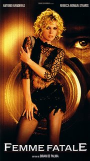
Brian De Palma’s exceedingly stimulating and sensational consideration of femme fatale iconography and the possibility of redemption within it begins with one of the director’s customarily brilliant, multilayered opening shots.
Under the black of the producers credits, familiar voices are heard. It’s Fred MacMurray. Fade up on a shot of an extreme close-up of a TV. It’s MacMurray, 525 broadcast lines blown up to big-screen size, in "Double Indemnity". But a close examination of the image reveals a splash of color -- something else is visible here, contrasting with the black-and-white images of Billy Wilder’s film. It’s a reflected image of a half-naked woman stretched out perpendicular across the TV screen. She is watching "Double Indemnity", and we see her watching the movie in her reflection off the glass TV screen. "Double Indemnity" continues to play out, crosscutting between MacMurray and the original femme fatale, Barbara Stanwyck (as Phyllis Dietrichson).
The image of the young woman becomes clear, yet remains slightly ghostly, as the image in Wilder’s film darkens. MacMurray moves to close a window, when a shot rings out. Stanwyck has betrayed him with a bullet, and the title credit "Femme Fatale" pops on screen at the same time, as the ethereal image of the woman, reclining on her side, dispassionately watching the movie, lingers. (The title credit “A Film by Brian De Palma” was earlier synchronized with Stanwyck’s first appearance on the TV.) Now De Palma’s camera begins to pull back. We see the cabinet of the TV, and we can now also observe that there are French subtitles superimposed on Wilder’s film. The image of the woman reflected in the TV seems even clearer now, as we continue to pull back, seeing her much more clearly in the flesh, gray tendrils rising from the cigarette she’s smoking while watching the TV. At this point there is double layering of the woman’s image, the reflection and the person being reflected, over the image of Stanwyck, who has taken a dominant position over her wounded lover as she confesses her machinations against him.
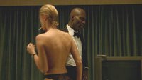
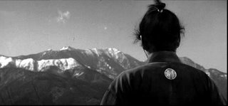
The camera pulls all the way back to reveal that the woman watching is nude, her ass covered by a sheet, her bare back and legs exposed to us. Like the samurai in "Yojimbo", we’ve not had a clear look at her face, except for what we could discern in the reflection on the TV screen, and we’ll be denied one for the length of the shot. Suddenly a door opens (off screen), outside light briefly streams in and the door closes, as we hear a man’s voice say, “What the fuck are you doing?” A black man in a tuxedo enters the frame from the left and turns off the TV. The woman has not moved, not acknowledged his presence, not said a word. The camera begins moving in on him as he begins to quiz her. “Do you know what time it is?” She gets up off the bed, revealing that she is at least wearing black panties, but totally unselfconscious in this man’s presence in the fact that she is otherwise naked. She stands and moves across him to the left, still smoking. She begins to dress and he continues in what seems at first to be a parody of the hardboiled language we’ve just heard and seen on the TV:
“Listen up. At 2200 Wetsuit’s down the hole when the snake hits the carpet. Security lifts the key. I terminate the torpedoes.”
The woman has now put on her top and moved completely out of frame to the left.
“Charm the snake into the stall. Bait and switch. At 2220 Wetsuit turns out the lights. Glasses on. I bag the snake.”
The camera is now pulling back as he moves left to where she is.
“Key in the bag. Bag to the boat. No radio unless absolutely necessary.”
The man has now seated himself next to the woman backward on a chair, as she continues to prepare herself at a vanity. She has still offered no response to what he is saying, or even really acknowledged his presence, or whether she is even hearing what he is saying or not. She tamps down her slick, short, dyed blonde hair with both hands, still holding a cigarette in the left.
“Code red, five minutes to blackout. Drop everything. Walk away. If the cops catch you, tell them the truth. You know no one. Got it?”
By now the man has begun staring at her intensely, looking for some hint that she is processing what he is saying to her.
“Got it?”
She leans into the frame, looks directly at him, coolly blows smoke in his direction, and nods.
“You have your passport?”
She flicks it into frame very casually. He peruses the document and continues:
“The plane leaves tomorrow at 0700.”
She flippantly offers a mock salute, as if to say, “Yes, sir, sir!” He smiles.
“And remember, no names and no guns.”
Suddenly there is the sound of a crowd chattering and milling about outside. The man acknowledges it with a cursory glance, but before we have had the chance to really process it ourselves, he leans forward slightly and slaps the woman hard across the face. She leans back, absorbs the blow and then slowly leans forward into a straight-up sitting position, her face still turned away from us and toward him, never taking her eye off of him. He continues:
“Are you high?”
She shakes her head slowly.
“Then stop dreaming, bitch. This isn’t a game tonight. People can die. Now get moving.”
He places the passport in his jacket pocket, rises up off the chair and moves away from her, toward the drawn curtain at the center of the room (and the frame). We become aware again of the sound of that mysterious crowd outside. He turns to her again, bends down out of frame and retrieves a headset, holds it up to her and says,
“You forget something?”
The woman emerges from the left, walks up to the man, never taking her eyes off his face, and grabs the headset from him. The producer’s credits are superimposed on the man as he rubs his hands together and considers this unflappable, impossibly cool woman. He adjusts his tie and his lapels, and light once again floods the room as the woman opens the door off screen. He turns sharply toward the window, reaches up and throws open the shade.
Cut to a long shot of the red carpet on closing night of the Cannes Film Festival. The credit is superimposed over the scene of the festivities: Directed by Brian De Palma.
JE: You picked a doozy here, Dennis! And there's so much communicated in this shot beyond the dialogue and the details of the caper, too. First, there's Double Indemnity -- the climactic scene of Double Indemnity, after MacMurray's plans have gone awry and he's wised up to what a sucker he's been -- with French subtitles. Well, the movie is called Femme Fatale, a French phrase, and now we assume we're probably in France. Visually, with that reflection/superimposition, De Palma transfers the title from Stanwyck to his "femme fatale" -- and, in movie terms, updates her in the process: She's still a blonde, but she's got a modern androgynous haircut... and she's nude, which is not something you would have seen in a 1944 Paramount Picture. (Also, something tells me this woman is not watching Double Indemnity for the first time; if anything, she's refreshing her study of it for her role in the movie we're about to see.)
I love the way De Palma compartmentalizes screen space here, too, using frames within frames. (Remember, this is a guy who loves split screen: Sisters, Carrie...) First there's the TV screen (which is also a mirror), then the window that is obviously behind the drapes, and which will be used for the final reveal you describe. As you say, the journey is from a film (DI on TV) ... to a film festival (outside the window). De Palma keeps composing and re-composing -- and I think my favorite little moment is when she thrusts her head into the left edge of the frame (this profile is the closest we get to seeing her non-reflected face) to defiantly confront the man, coordinator of the unfolding plot, who is there to keep her in line. At the mirrored vanity, we have more frames-within-frames, but De Palma keeps us craning our necks to see more (kind of like Polanski's famous doorway shot of Ruth Gordon on the bedroom phone in Rosemary's Baby). He never actually shows us a clear reflection of the woman in those mirrors, frustrating our expectations. At the end of the shot we don't see her leave, but the light from an opened door (to the bathroom? hallway?) spills into the room. The movie's visual strategy has been beautifully set up now: We will be seeing pictures within pictures, one part of the whole but never the Big Picture... until the end of the picture.
This Jim Emerson guy is good!
*************************************************************************************
And finally, here’s my entry on Yojimbo (again, thanks to Jim for the screen grabs):
*************************************************************************************
The samurai films of Akira Kurosawa, themselves heavily influenced by the films of John Ford, were subject to reinterpretation several times themselves, the most famous examples being John Sturges’ refashioning of "Seven Samurai" into "The Magnificent Seven" and, more profoundly, Sergio Leone forging not only a remake, but the foundation of his entire directorial style, out of the discoveries he would make as he twisted new shapes into "A Fistful of Dollars" out of the original clay of Kurosawa’s "Yojimbo." Leone’s film follows Kurosawa’s template closely, but even by looking just at the opening shot it’s possible to see some of the parallels, and the differences, between Kurosawa and Leone.
The film begins on a close-up of a mountain range. A man, seen from behind and shot from a low angle, moves into the frame and observes the range which looms spectacularly before him. Leone might stage this shot to emphasize the landscape dwarfing his human figure by placing the figure low and small in the frame against the mountains. But Kurosawa achieves the same effect by giving the man roughly the same amount of graphic weight in the frame, but by shooting him from a low angle and keeping his face hidden from us. The man, dressed in the clothes of a samurai (the clothes themselves are ragged, worn and dirty), holds himself with dignity, adjusts his shoulders, and then, in a gesture that will find echoes throughout Leone (particularly in the opening of "Once Upon a Time in the West," reaches up under his robe and unceremoniously scratches his head—with a single scratch, the deflation of the image of this dignified samurai warrior is underway.
The warrior looms in the frame, the mountain range but a background, and begins to move off to the left as the credits roll. We’re still seeing the man essentially only from behind, and he has now moved away from the mountain range, and Kurosawa still shoots him from that low angle—he is framed now only against the white, clouded sky of the afternoon. With the range now receded into absence, the man now seems to tower over his surroundings, greater than all he surveys—though nothing that he surveys is visible at this point in the shot. He looms large even as he moves deliberately along, adjusting his collar. Upon the appearance of the credit “produced and directed by Akira Kurosawa” the camera tilts down and we see the man’s raggedy sandals as he pads along on a dirt road—the landscape has been brought down to the level of this man moving silently through it. The visual strategy here is the inverse of close-ups and lone figures against the landscape that would mark Leone’s adaptation of "Yojimbo," and then eventually his entire style—in the opening of "Yojimbo", as the samurai moves along the road, the surrounding landscape dwarfs him by creating not a sense of its expansiveness, but instead of the claustrophobia created the tall grass alongside the road and the way the director angles the perspective on the man to exclude a sense of anything but the immediate space surrounding him.
The mountains have long since disappeared behind the tops of the grass as the samurai encounters some stone markers along the road and turns past them, as if to examine them. A series of title cards reads: “The time is 1860. The emergence of a middle class has brought about the end to power of the Tokugawa Dynasty.” The man’s observance of the markers is but a momentary distraction and he is soon heading back down the road. As he moves along, the mountain range returns to the top of the frame, only it too is dwarfed graphically by the expanse of grassy field the man finds himself moving through.
More title cards: “A samurai, once a dedicated warrior in the employ of royalty, now finds himself with no master to serve other than his own will to survive… and no devices other than his wit and his sword.” The man has encountered a fork in the road, each trail leading he knows not where, and his preference of destination is nonexistent. His next move, like the momentary, alternating allegiances that he will assume later in the film, will be left to chance, as will his own fate. He takes in the surrounding space of the divided road, still surrounded by tall grass, and comes upon a large stick, which he picks up and tosses in the air. Where it lands will determine what direction he goes, what road he takes…
*************************************************************************************
The Scanners Opening Shots Project will continue for the foreseeable future. Keep an eye on Jim’s site for the next fascinating entries!